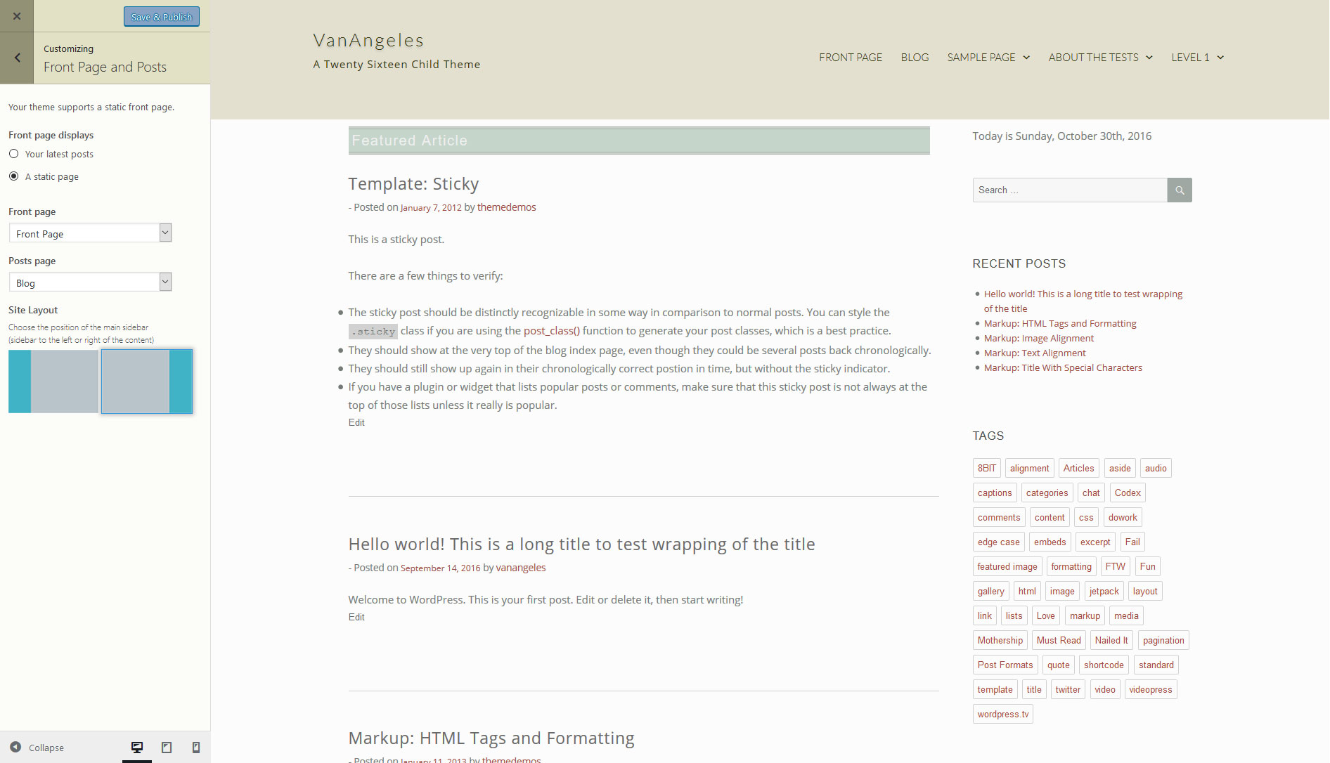
Full-page template
Twenty Sixteen gives you the choice of going with a single column page or including a optional right-hand sidebar. Unfortunately, it’s an either/or proposition: To achieve the single column look means leaving the sidebar widget blank and that, in turn, means that the sidebar will no longer be visible on any posts or pages. The problem is easily solved by making a copy of the Twenty Sixteen page.php file and putting it in the child theme folder and calling it something like page-full.php. Put the following at the top of the file:
<?php
/**
 * Template Name: Full-width Page Template
 *
“Template Name” will now make the file visible as a template in the Page editor. Remove the line:
<?php get_sidebar(); ?>Now you can choose the Default Template and have a sidebar, or choose the Full Page Template for a full-width page with no sidebar.
Left or right sidebar
Some people like it on the left, some people like it on the right. Twenty Sixteen has the sidebar on the right, but I thought I’d add an option to the Kirki version of the customizer to place it on either side. I chose to put a Site Layout control in the Front Page and Posts panel (originally called Static Front Page) by adding the following to kirki-customizer.php:
$fields[] = array(
	'type'        => 'radio-image',
	'setting'     => 'blog_layout',
	'label'       => __( 'Site Layout', 'vanangeles' ),
	'description' => __( 'Choose the position of the main sidebar
(sidebar to the left or right of the content)', 'vanangeles' ),
	'section'     => 'static_front_page',
	'default'     => 'sidebar-right',
	'priority'    => 10,
	'option_type' => 'theme_mod',
	'choices'     => array(
	        'content-area-right' => trailingslashit( get_stylesheet_directory_uri() ) . 'images/2cl.png',
	        'content-area-left' => trailingslashit( get_stylesheet_directory_uri() ) . 'images/2cr.png',
		),
	);
Since the panel already exists I just had to define the containing section as static_front_page. This control is simply a radio control allowing the user to choose between two options: In this case, content on the right (left sidebar) or content on the left (right sidebar). Instead of traditional radio buttons, the user selects one of the two images depicting each scenario.

The selection returns either content-area-right or content-area-left for blog_layout. After making a copy of Twenty Sixteen’s index.php and putting it in my child theme’s directory, I changed the line:
<div id="primary" class="content-area">to
<?php if ( get_theme_mod( 'blog_layout' ) == '' ) {  ?>
		<div id="primary" class="content-area">
	<?php } else { ?>
		<div id="primary" class="<?php echo get_theme_mod('blog_layout'); ?>">
	<?php } ?>
The control will return the blog_layout variable as either class="content-area-left" or class="content-area-right", depending on the user selection. Similarly, I modified sidebar.php to return a class based on the blog_layout variable:
<?php if ( is_active_sidebar( 'sidebar-1' )  ) : ?>
	<?php if ( get_theme_mod( 'blog_layout' ) == 'content-area-right' ) {  ?>
		<aside id="secondary" class="sidebar-left widget-area" role="complementary">
	<?php } else { ?>
		<aside id="secondary" class="sidebar-right widget-area" role="complementary">
	<?php } ?>
This basically says, “If the content is on the right, put the sidebar on the left, otherwise, put the sidebar on the right.” Now to create styles for both of those conditions. In the child theme stylesheet – style.css – I added the following:
@media screen and (min-width: 56.875em) {
	.content-area-left { /* Default */
		float: left;
		margin-right: -100%;
		width: 70%;
	}
	.sidebar-right { /* Default */
		float: left;
		margin-left: 74%;
		padding: 0;
		width: 26%;
	}

	.content-area-right {
		float: right;
		margin-right: 0;
		margin-left: -100%;
		width: 70%;
	}
	.sidebar-left {
		float: left;
		margin-right: 74%;
		margin-left: 0;
		padding: 0;
		width: 26%;
	}
}
Thanks again to Ragnar over at Design Bombs for the style snippet that makes this work. I read other recommendations on the WordPress forums, but this worked best for me.


